
Financial crises are integral elements of capitalism, but sometimes economic policies make crashes more pronounced than necessary. A cataclysmic crash is looming. Can we avoid The Inevitable Great American Reset?
About the author

Carl W. Hafele is a money manager, professor of economics and finance, and an avid student of economic history. He became fascinated with the economic and personal consequences of financial crashes as a child, when he learned his absent grandfather “went down with the Crash” of 1929.
A former CEO and portfolio manager at National Asset Management and later INVESCO, Carl’s three decades of financial experience include managing over $20 billion in assets. He teaches investment, business, and economic courses at Bellarmine University, has taught on the international level, and is currently the Managing Director and Principal at Lanier Asset Management and a Financial Consultant at First Kentucky Trust Company.
A Chartered Financial Analyst and Certified Public Accountant, Carl received an MBA in finance from Xavier University. He coaches basketball and soccer, is a private pilot, and a member of numerous philanthropic organizations. Carl and his wife, Marianne, enjoy travel, exercise, and “having a blast” with their seven children.
What you will learn
Booms and Busts
Learn why and how they happen.
Crash Factors
What brings us down and what keeps us there?
The Hangups
Learn what prevents us from making the right economic decisions.
The Solution
Learn what you can do to survive the next reset.
Messages from readers

ForeWord Clarion Review
"well written, well designed and well documented ... Carl Hafele has done a yeoman’s job of analyzing America’s financial crises dating back to before the twentieth century."

Kirkus Reviews
“A straightforward, conservative history of economic crises in America ... It’s difficult to argue that Hafele doesn’t know what he’s talking about”
Robert Brown, PhD, London School of Economics - Author
Imagine you can understand recent US and global financial crises from the inside. Imagine you have someone who was there explain to you what happened. Now imagine that insider was also a teacher who knows how to describe complex events and relationships, and that he can explain these financial crises to you clearly. Carl Hafele makes that imagination a reality with this book.
Samples from the book
Financial Crisis of 2007
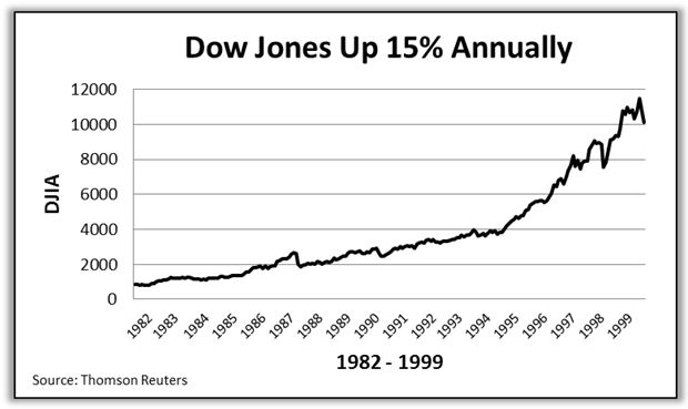
Combining the 1982-1994 era with the 1995-1999 period, one truly obtains a picture of beauty.
The annual rate of return on the DJIA was over 15% during the 1982-2000 market advance. The Dow went from 875 to 11,497—cumulatively an increase of over 1,200%. So investors that invested solely in the stock market increased their net worth twelvefold! Total return including dividends was 18% per year. What a run for nearly twenty years! Recall that in average or “normal” times, stocks deliver total returns of 10-11% annually.
Why is the 2000 stock market mini crash so important to economic history? The answer here is just like the analysis of the other financial crises— they are preceded with incredible periods of prosperity. “Happy Days are Here Again” is the best musical description. I would bet anyone long odds that the baby boomers will unfortunately not get to experience this once-in-a-lifetime period of prosperity again. I hope I am very wrong, but history suggests not.
In 1995, the initial public offering (IPO) market went crazy. Futuristic companies went public without ever delivering or even promising to deliver a profit! In hindsight, that sounds extremely silly. With promises of synergies, B2B (business- to-business), Internet speed growth, and more, fuel was put on the fire by unscrupulous Wall Street analyst-turned-investment bankers. They recommended companies to simply obtain underwriting fees. A modern day gold rush was at hand.
*****
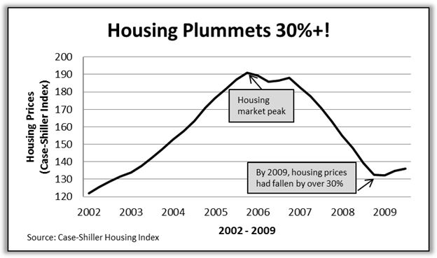
The housing bubble burst—and man did home values plummet!
The most often used indicator of the housing market is the Case Shiller Housing Index. It shows that housing prices declined over 30% in 2007-2009, erasing virtually all the buildup from the 2002-2006 four-year increase. It was a steady three-year retreat.
Investors throughout the world began to feel the effects. First, the hedge funds that held the lower-rated “tranches” of mortgage securities lost their shirts, and the higher-rated securities were undressed. It was not pretty. As these securities were held worldwide, an international impact occurred and a complete loss of trust in the financial marketplace ensued.
Economic Policies
Equally as important as the deficits is the summing up of them to quantify our total debt. For the accountant types, this summarizes all the prior years and is known as the balance sheet. For others, it simply answers the question of, “How well, financially, is the business doing?”
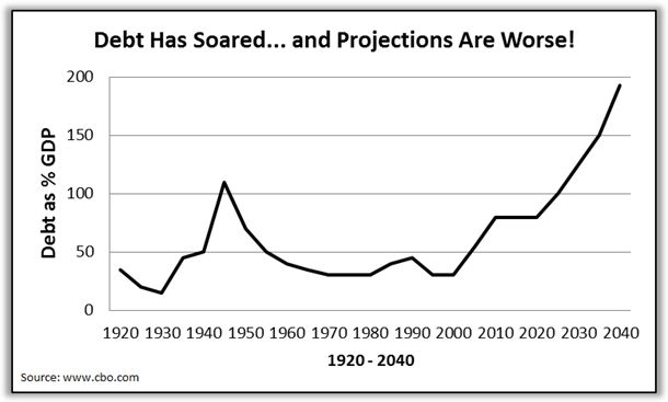
As with the prior chart on deficits, debt is also best analyzed as percent of GDP. For over 200 years of our great nation’s history, with the 1940s defense of capitalism being the exception, we maintained our debt levels at a manageable 25-45% of GDP. So let’s center on 35%.
In the four-year period of 2008-2012, the debt doubled to over 70% of GDP.
So my daughter asked, “Am I correct? Am I getting this? We kept debt at a respectable level for over 200 years of around 35%, and in just four years, we doubled it? Is that really possible?” While proud of my daughter’s acuity, my response was a melancholy, “Yes, my dear. This thing is a mess, and is heading in the wrong direction.”
The budget history and projections are solely functions of spending more than collecting—lower revenue because of low economic growth rates and much higher spending—“like a drunken sailor.” We have a monumental spending addiction!
Team USA
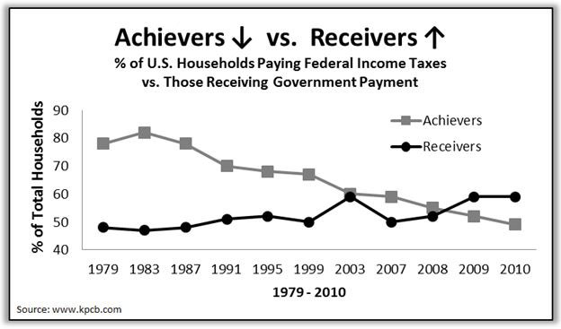
Mother Shirley preached that there would always be achievers and receivers—and life’s givers are so much more rewarded than the takers. So how many achievers and receivers are there now and what’s the trend?
Well, I love you Mom and I still agree that giving makes people happier. But I am starting to feel like a relic.
In the 1980s era, the data shows that about four out of five American households paid federal income taxes. About 25 years ago, a descent commenced down to the current day level of under 50%. Half of America does not pay federal income taxes! And those receiving government-paid benefits (including Social Security, Medicare and Medicaid, education and energy assistance, unemployment compensation, subsidized housing, food stamps, earned income credit, and more) has soared. An incredible 59% of the population now receives government payments. Fifty-nine percent! In comparison, that number was approximately 20% in the mid-1960s.
*****
Government has become a very large and growing part of our economy. Is that good or bad?
The answer to that question can be addressed with another simple question: Does the size of government increase or decrease our quality of life? If so, how much effect does it have? In other words, does government size really influence per capita GDP growth rates?
Below is a graph of GDP growth rates of 23 developed countries for the 50-year period from 1960 to 2010.
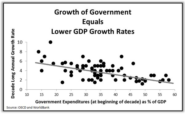
Each dot represents a ten-year period of economic growth of a single country and the size of government for that same country at the start of the decade. The observations tell us, collectively through using a multiple regression analysis, that there is a downward sloping line, which illustrates that as government gets larger, GDP growth slows. Thus, the quality of our lives does not increase as government gets larger. It actually decreases! This is a really important concept!
Investment Perspective
Professor Jeremy Siegel’s 1994 book called Stocks For The Long Run became an essential item for any money manager or market historian’s bookshelf. In summary, Dr. Siegel proves that decade after decade, the only way to accumulate wealth is through investing in the stock market. The effects of inflation further made his case that the equity market is the only place to invest.
And he was correct… until the 2000 to 2010 decade. Somehow, we had a 30% fall, as the dot-com boom corrected, followed by a 50% correction from the Financial Crisis. And voila bonds outperform stocks in the decade, even though bond yields commenced the decade at historically low rates.
But things are quite different now. Yields are lower than low. The Fed used all of its tools and more, and stock valuations are more reasonable.
Most say that the rally back to 2007 highs in stocks illustrates the worst is over economically, and the easy money in stocks has already been made. Or, are we in the early stages of the next great bull market? History provides some suggestions.
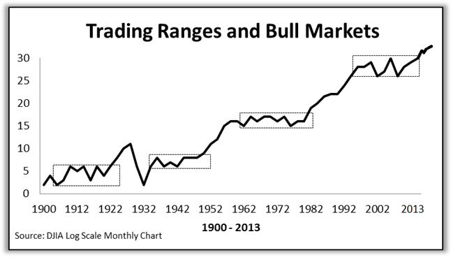
The stock market has returned approximately 10% per year, but you may notice from the above chart, there are eras of immaterial advances called “trading ranges,” followed by periods of material advances associated with bull markets. Sideways markets typically last 18 to 19 years, taking their time “making a base,” and then head off to the races. And they go for a few decades, with annual rates of return at approximately 15% or more. This is as real as it gets when talking about how means (averages) are formed—they rarely are represented but instead have periods far from the mean on both sides.
Choose a Topic
-
Financial Crisis of 2007
- -
Economic Policies
- -
Team USA
- -
Investment Perspective
-